style
Brutalist
Deliberate rawness, hard contrast, and visible structure without sacrificing usability.
Released mappings (0)
No canonical mapping is published for this dimension yet.
The visual catalog below is available for exploration, but it is not presented as a recommendation for this coordinate.
Available section evidence (25)
Browse the released section library while this taxonomy gap remains explicit.
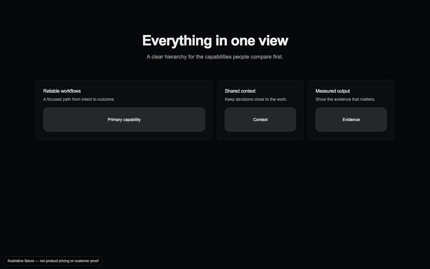
Capabilities Bento
A mixed-size capability grid that gives the primary feature the largest visual weight while keeping supporting capabilities scannable.
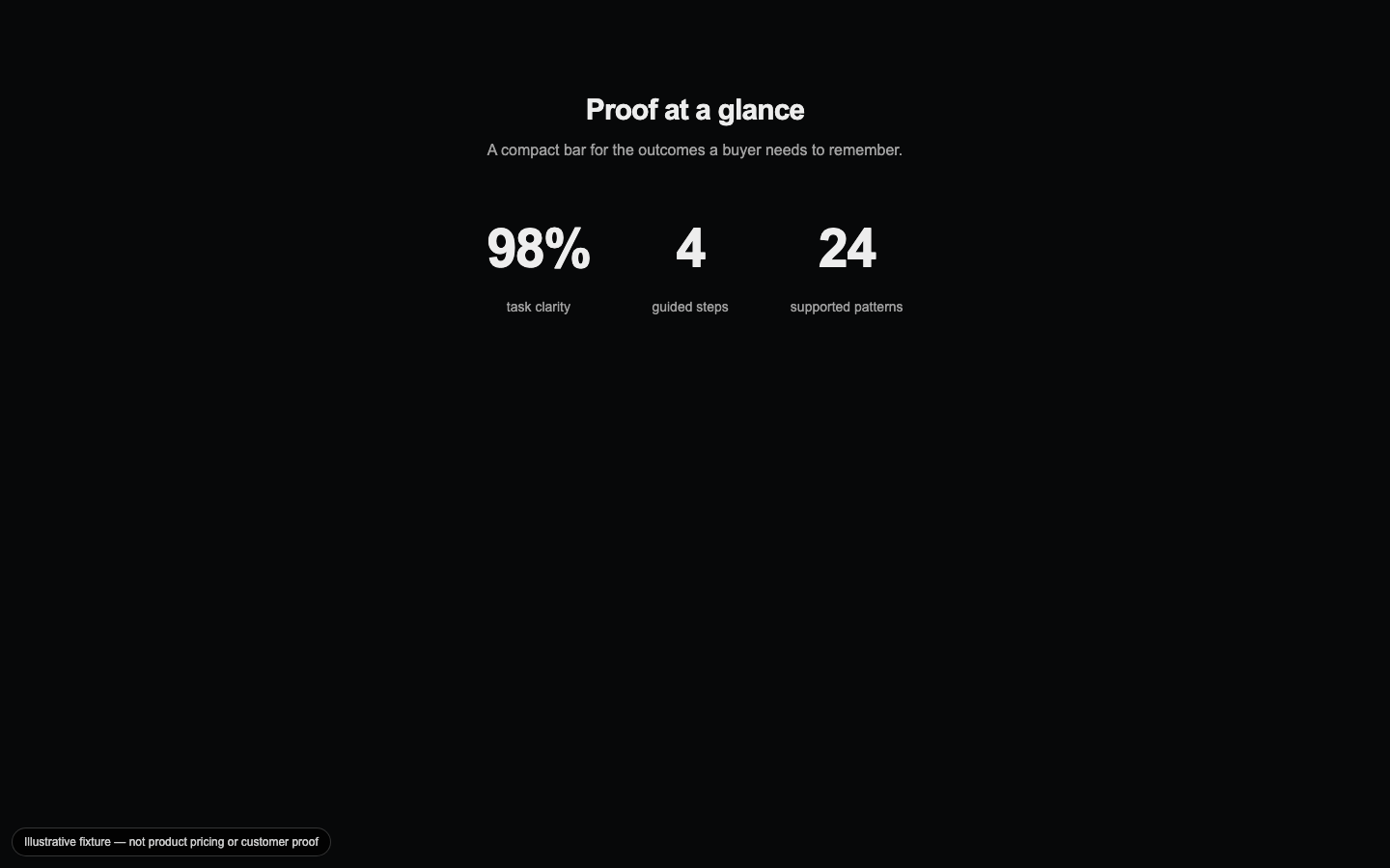
Counter Bar
A compact metric bar that turns a small set of measured outcomes into an animated, readable proof row.

FAQ Accordion
An accessible expandable Q&A section with single- or multi-open behavior for resolving objections near the end of a page.
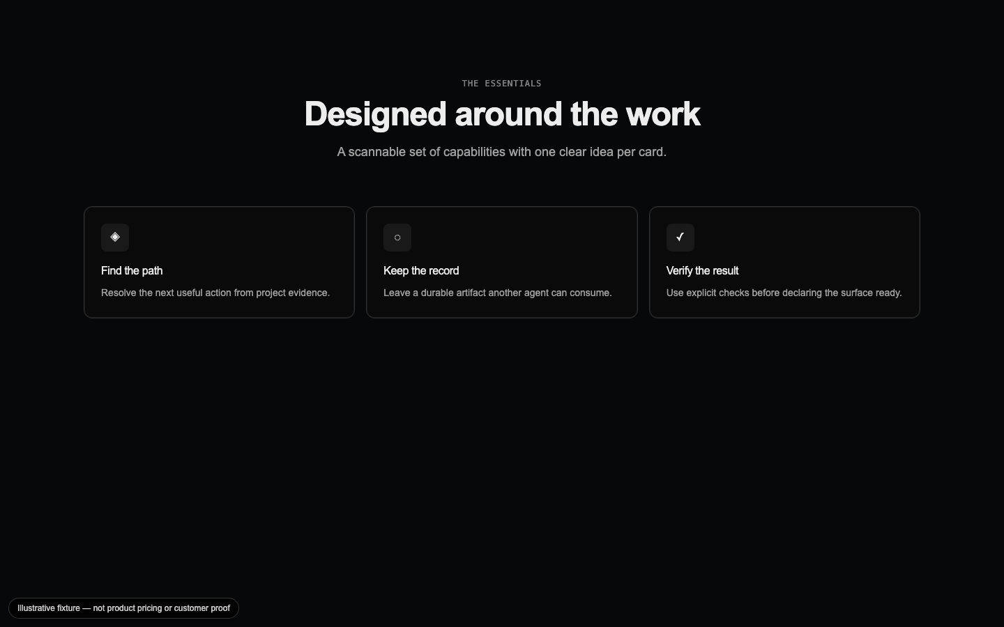
Feature Card Grid
A responsive icon-card grid that makes a capability set easy to compare without turning every feature into a separate page.

Footer Navigation
A utility-rich footer column layout derived from the shared navigation data so hubs, legal links, and contact paths stay aligned.
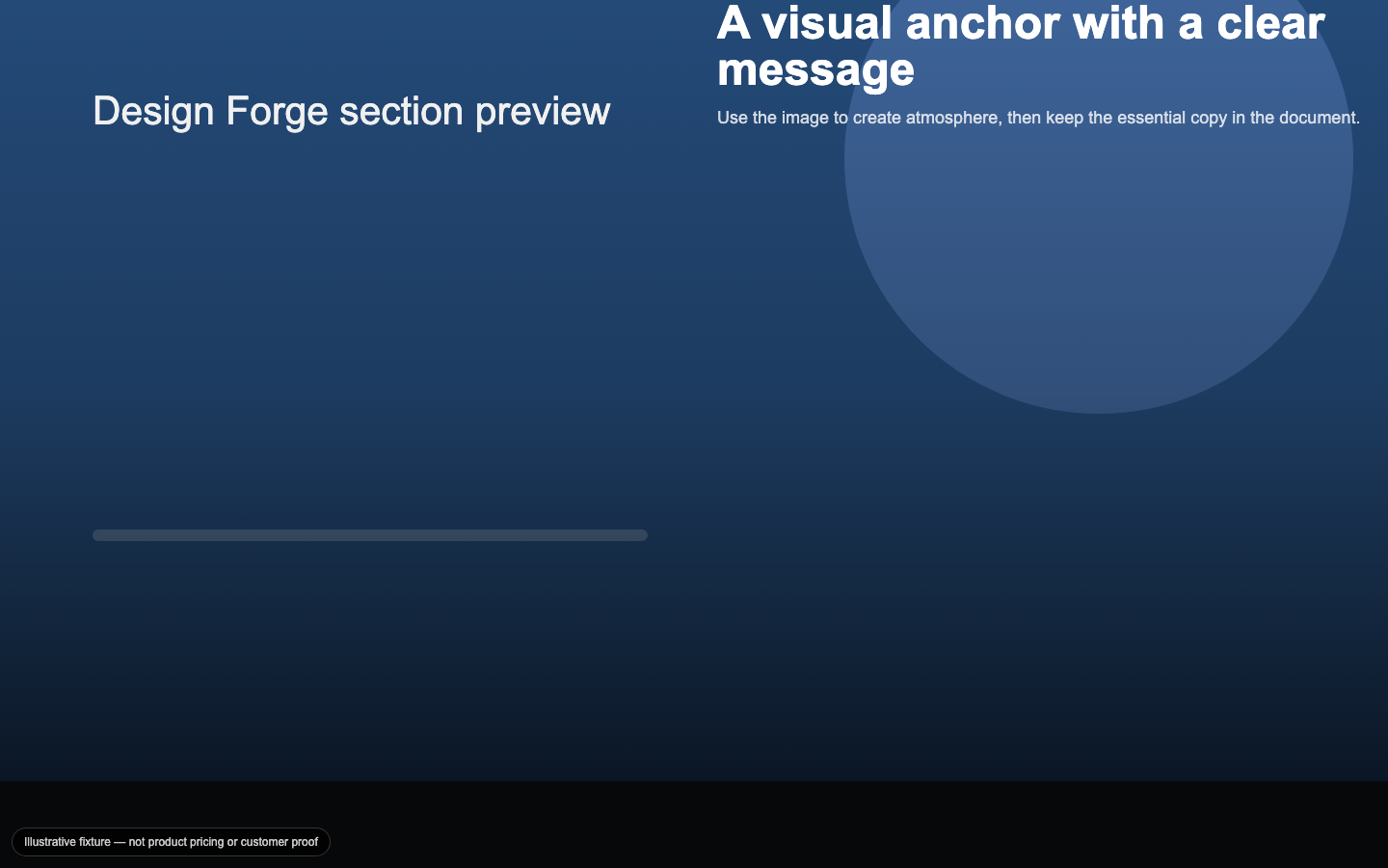
Full-Bleed Media
An edge-to-edge image section with a positioned text overlay and scrim that keeps the message legible over visual media.

Gradient CTA
A closing call-to-action with a restrained gradient field, clear hierarchy, and explicit primary and secondary paths.
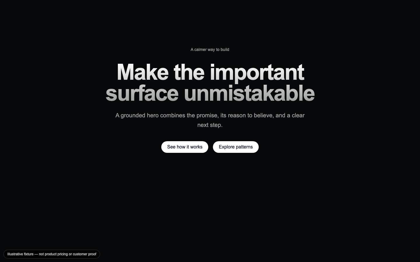
Gradient Headline Hero
A centered opening statement that pairs a high-contrast headline with supporting copy, announcement context, and conversion actions.
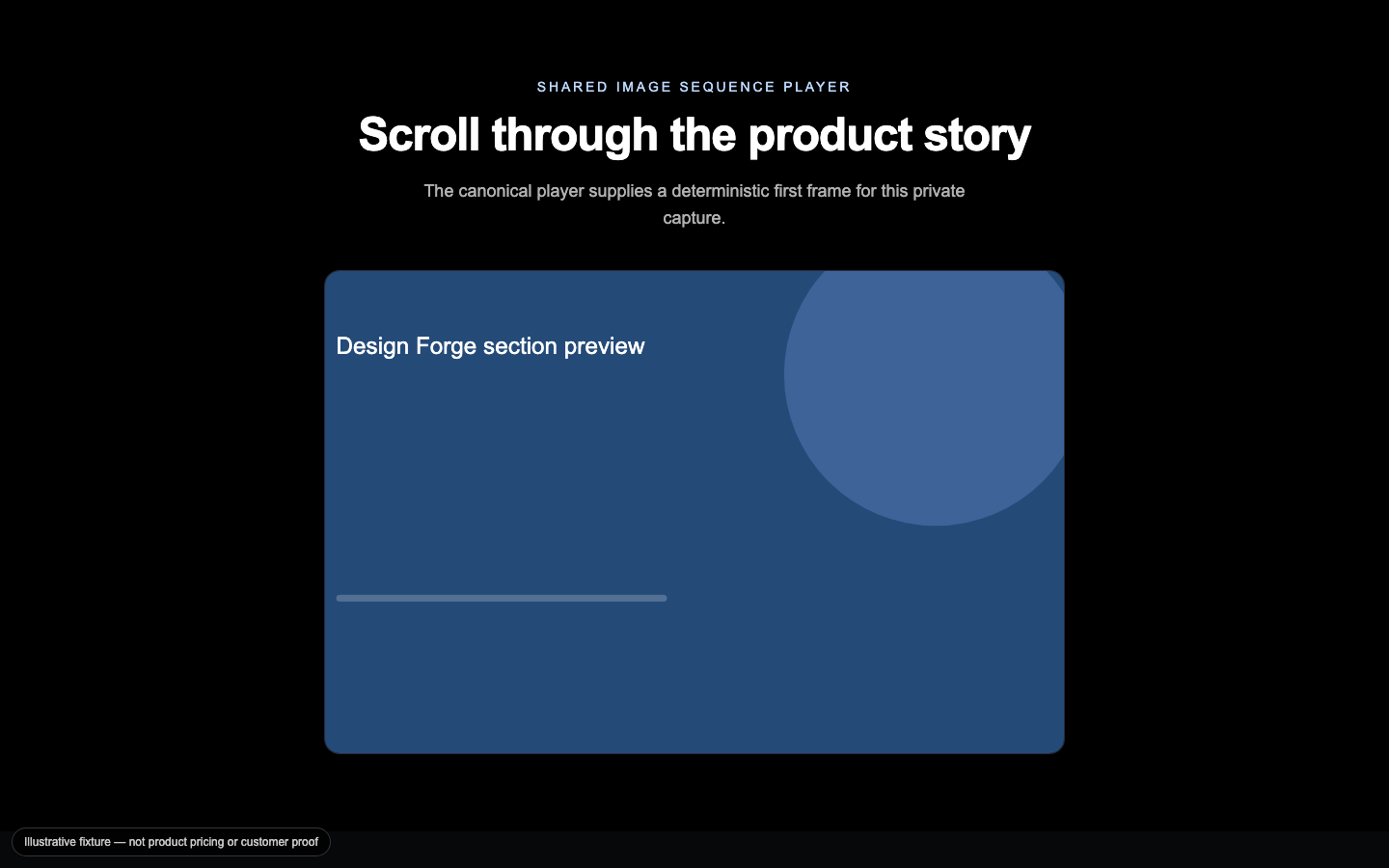
Image Sequence Scroll
An Apple-style frame sequence that reveals a product through scroll while retaining a deterministic first-frame fallback for reduced motion.
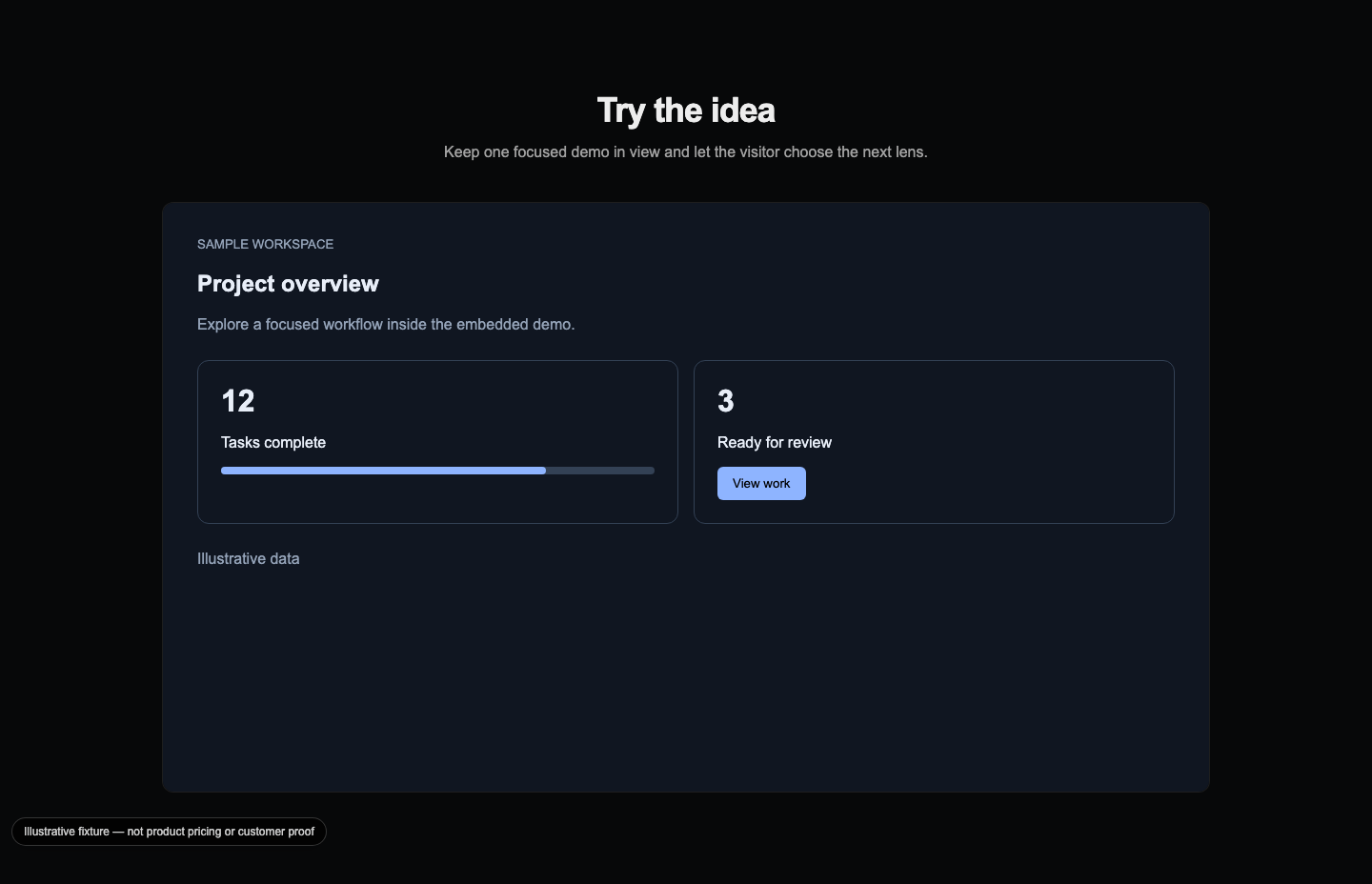
Interactive Demo
A tabbed demo container that presents one focused playground at a time with a visible loading state and responsive frame.

Logo Marquee
A trust strip that moves partner marks as a CSS loop and degrades to a static, accessible logo group under reduced motion.

Mega Menu Navigation
A segmented hub-to-spoke navigation panel that keeps top-level choices bounded while giving each destination useful context.

Navbar
A compact marketing header with shared navigation data, one primary action, and a mobile drawer fallback.
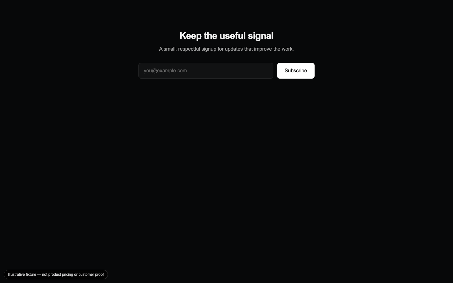
Newsletter CTA
A low-friction email capture section that shows pending, success, and failure states without leaving the page.

Parallax Layers
A layered media composition that separates background and foreground depth while disabling scroll choreography for reduced-motion and minimal intensity.

Pinned Timeline Showcase
A phased, pinned product story that sequences title, subtitle, metrics, and a visual before handing control back to the page.
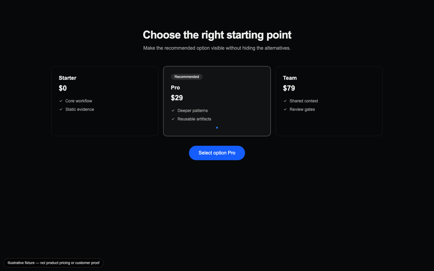
Product Options CTA
A plan or product option comparison that makes the recommended choice visually explicit while keeping alternatives scannable.
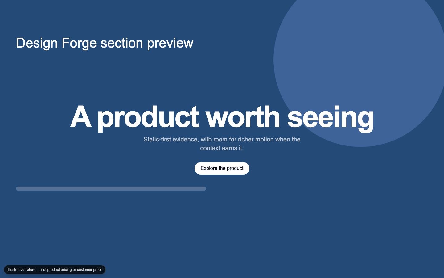
Product Reveal Hero
A full-viewport product entrance driven by image-sequence progress, with a static hero image as the no-motion path.
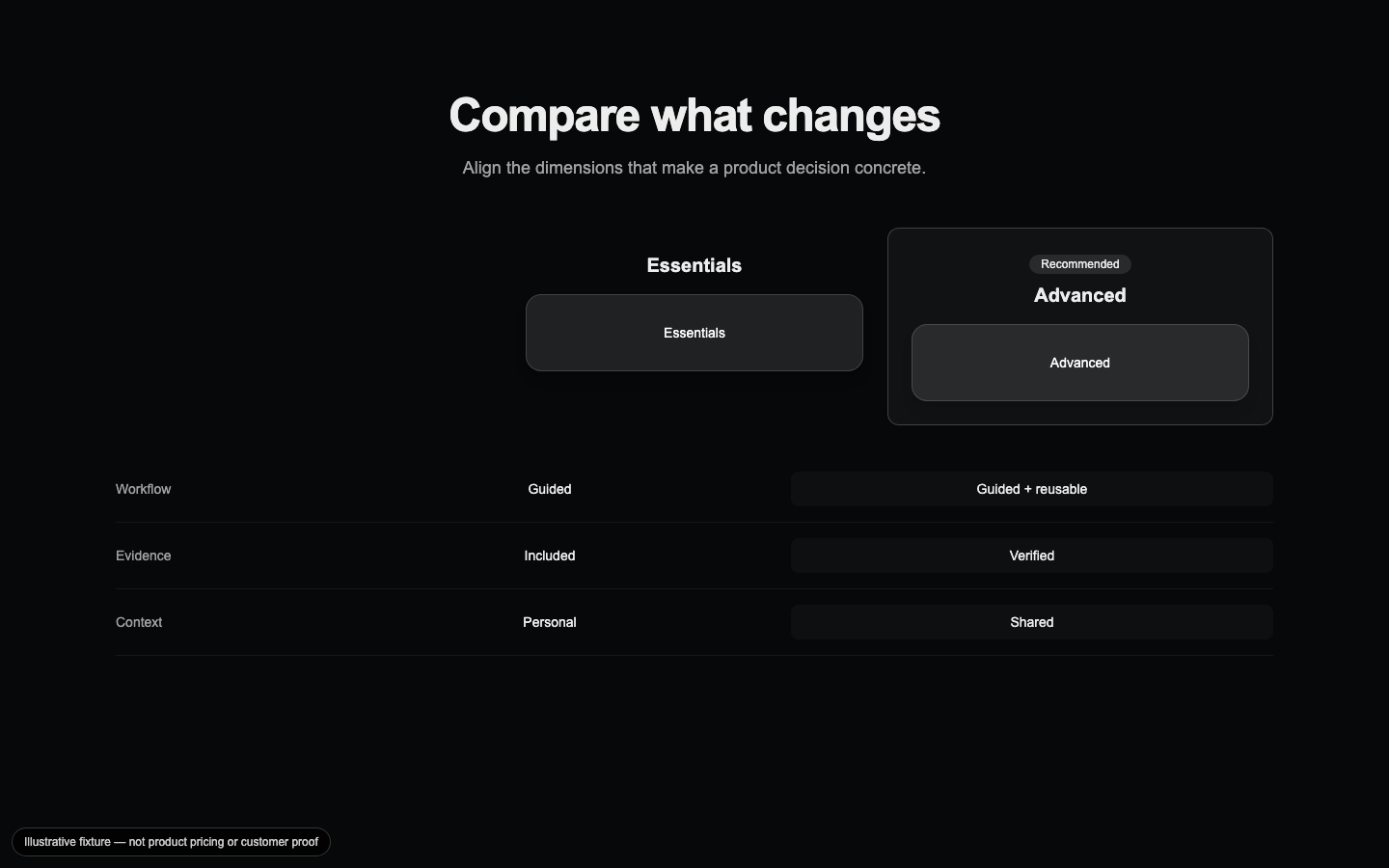
Spec Comparison
A side-by-side specification grid that gives a product decision concrete, aligned evidence instead of a loose feature list.
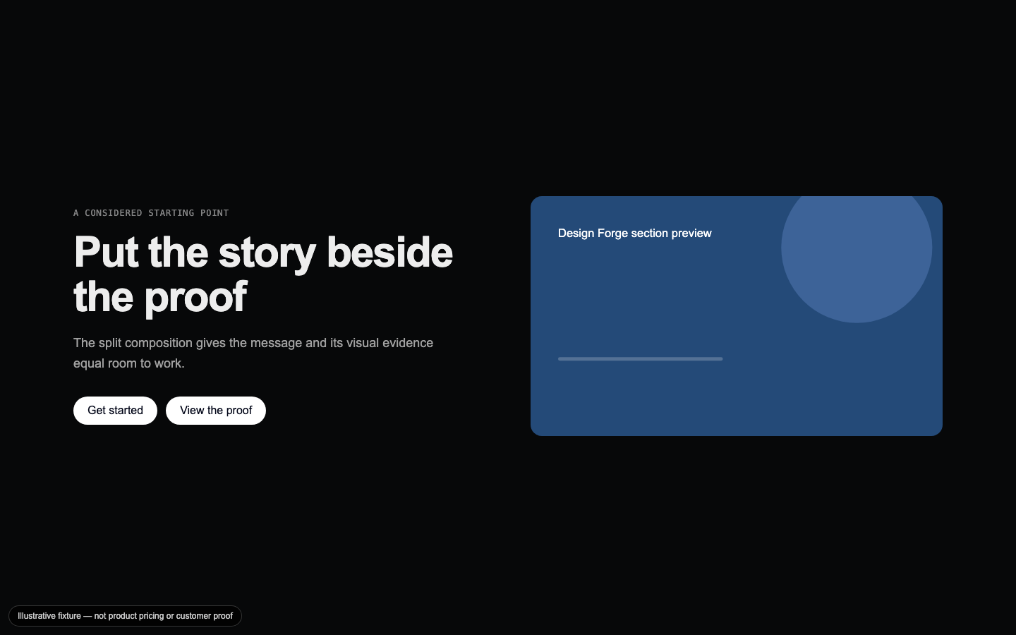
Split Media Hero
A two-column opening layout that balances concise positioning copy with a responsive media surface.
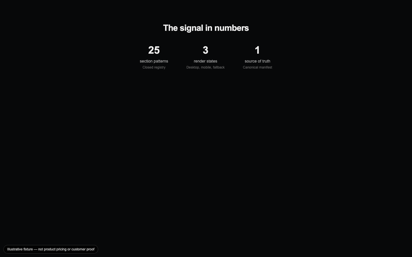
Stats Showcase
A quiet statistics presentation for trust-sensitive surfaces where the numbers should carry the visual emphasis.

Sticky Sidebar Content
A documentation-shaped section with a sticky table of contents and scroll-spied content blocks for long-form reading.
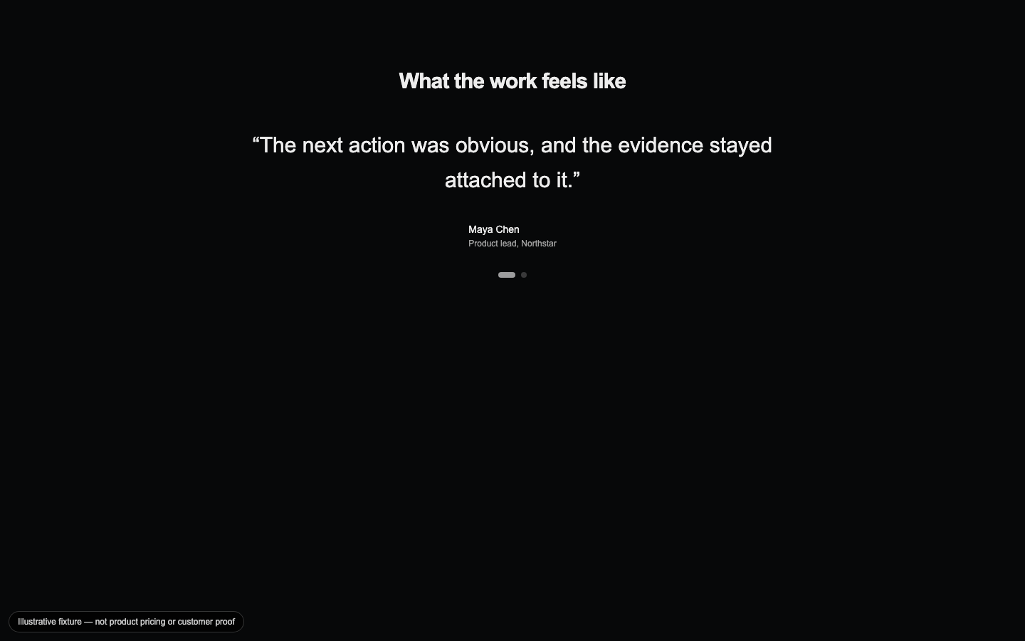
Testimonial Carousel
A keyboard-navigable testimonial rotation that pauses on interaction and turns customer voice into a focused proof moment.

Trust Signals
A compact row of certification badges and measured claims for health, finance, legal, and service contexts.
Video Scroll Reveal
A poster-first video section that uses scroll to reveal the media while retaining a still frame when motion or playback is unavailable.