style
Organic
Warm color, rounded rhythm, and natural visual cues for human-centered experiences.
Released mappings (1)
Hospitality · Website · Organic
gentle · css-layers · section-fade-sequence
Hero Centered · Feature Cards · Masonry Grid
Recommended section evidence (12)
These rendered sections are named by the released taxonomy mappings above.

Navbar
A compact marketing header with shared navigation data, one primary action, and a mobile drawer fallback.
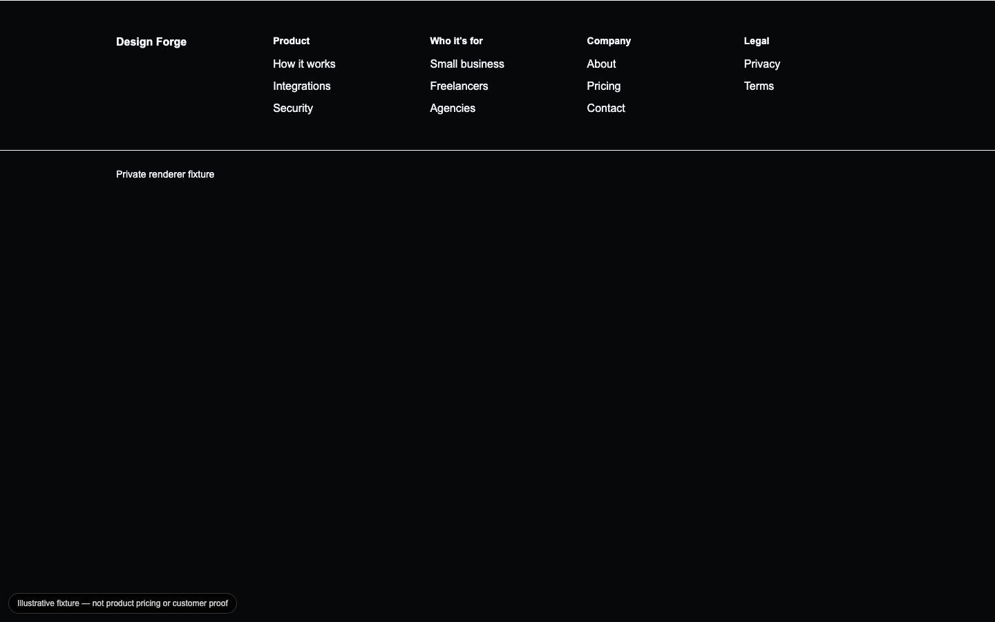
Footer Navigation
A utility-rich footer column layout derived from the shared navigation data so hubs, legal links, and contact paths stay aligned.
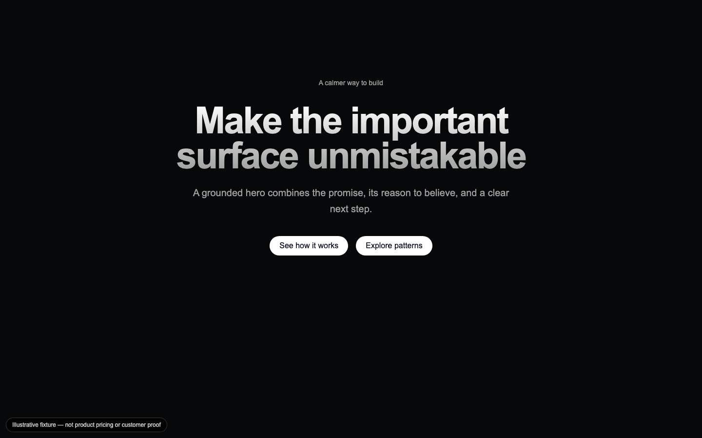
Gradient Headline Hero
A centered opening statement that pairs a high-contrast headline with supporting copy, announcement context, and conversion actions.
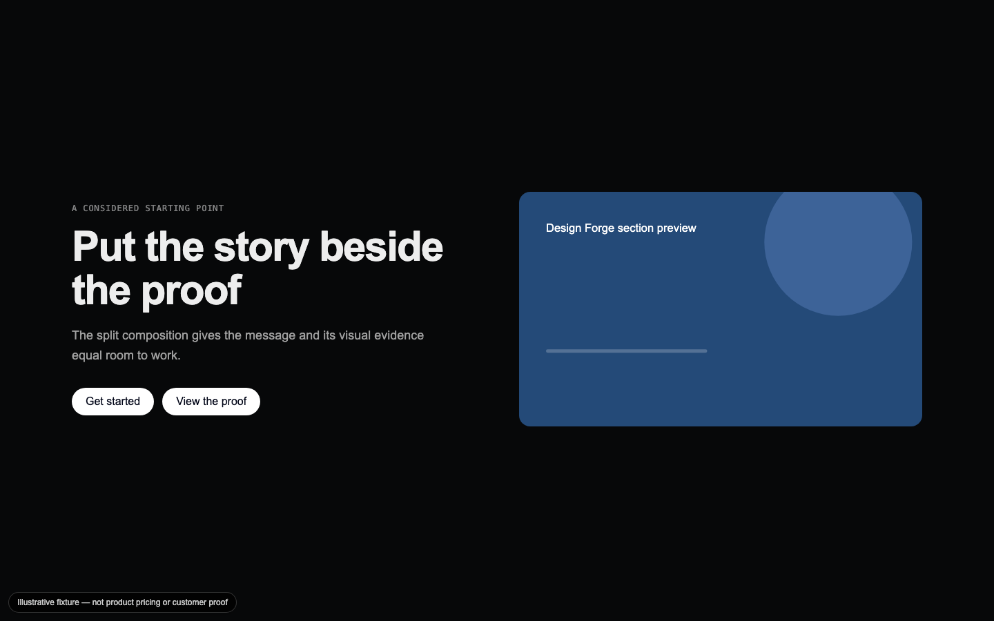
Split Media Hero
A two-column opening layout that balances concise positioning copy with a responsive media surface.
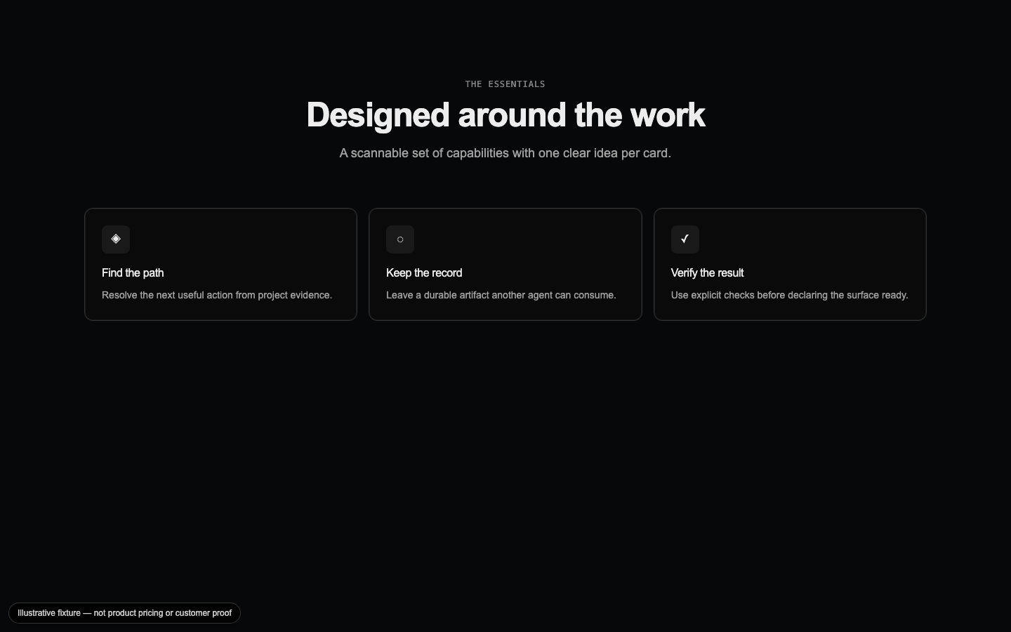
Feature Card Grid
A responsive icon-card grid that makes a capability set easy to compare without turning every feature into a separate page.
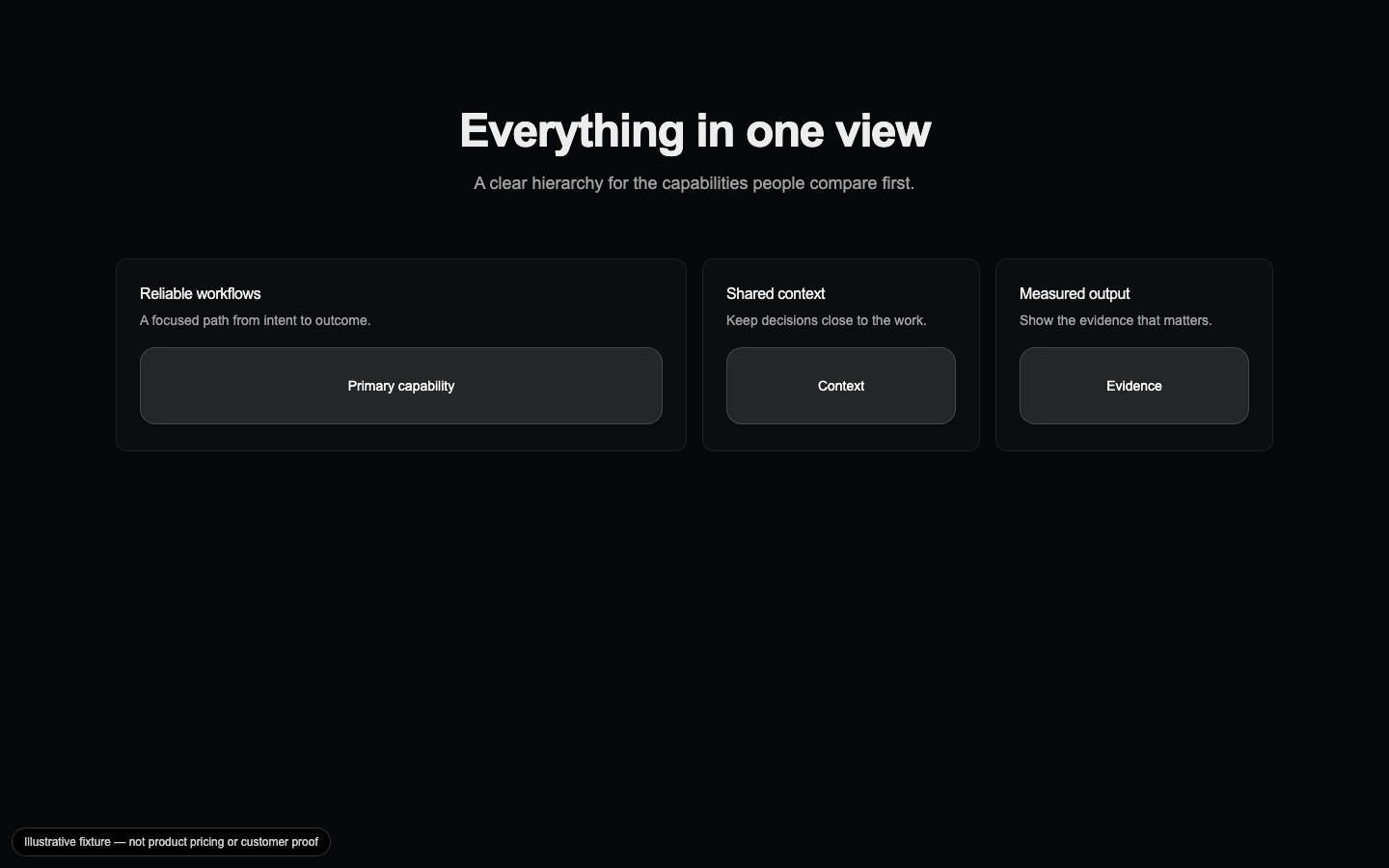
Capabilities Bento
A mixed-size capability grid that gives the primary feature the largest visual weight while keeping supporting capabilities scannable.
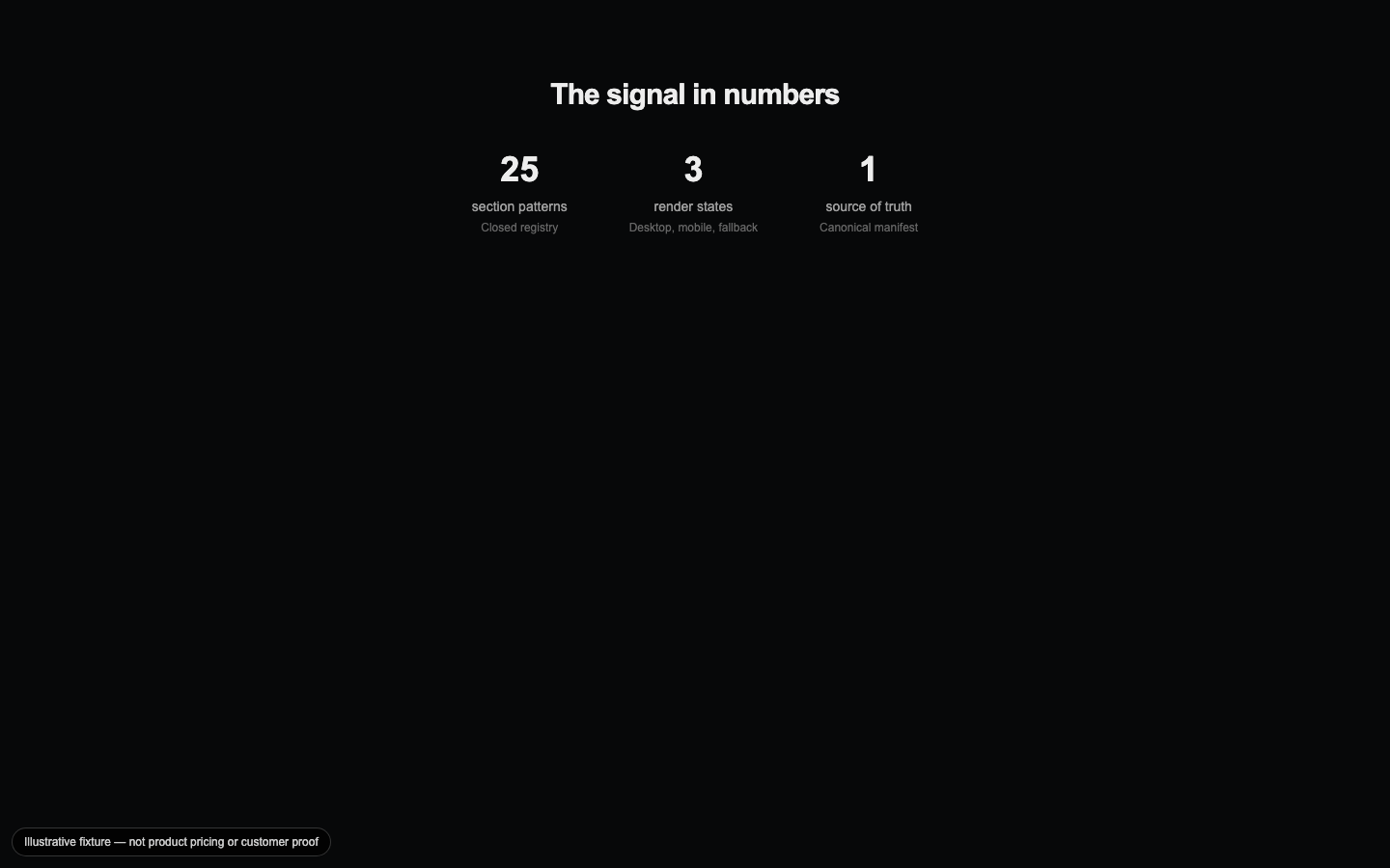
Stats Showcase
A quiet statistics presentation for trust-sensitive surfaces where the numbers should carry the visual emphasis.
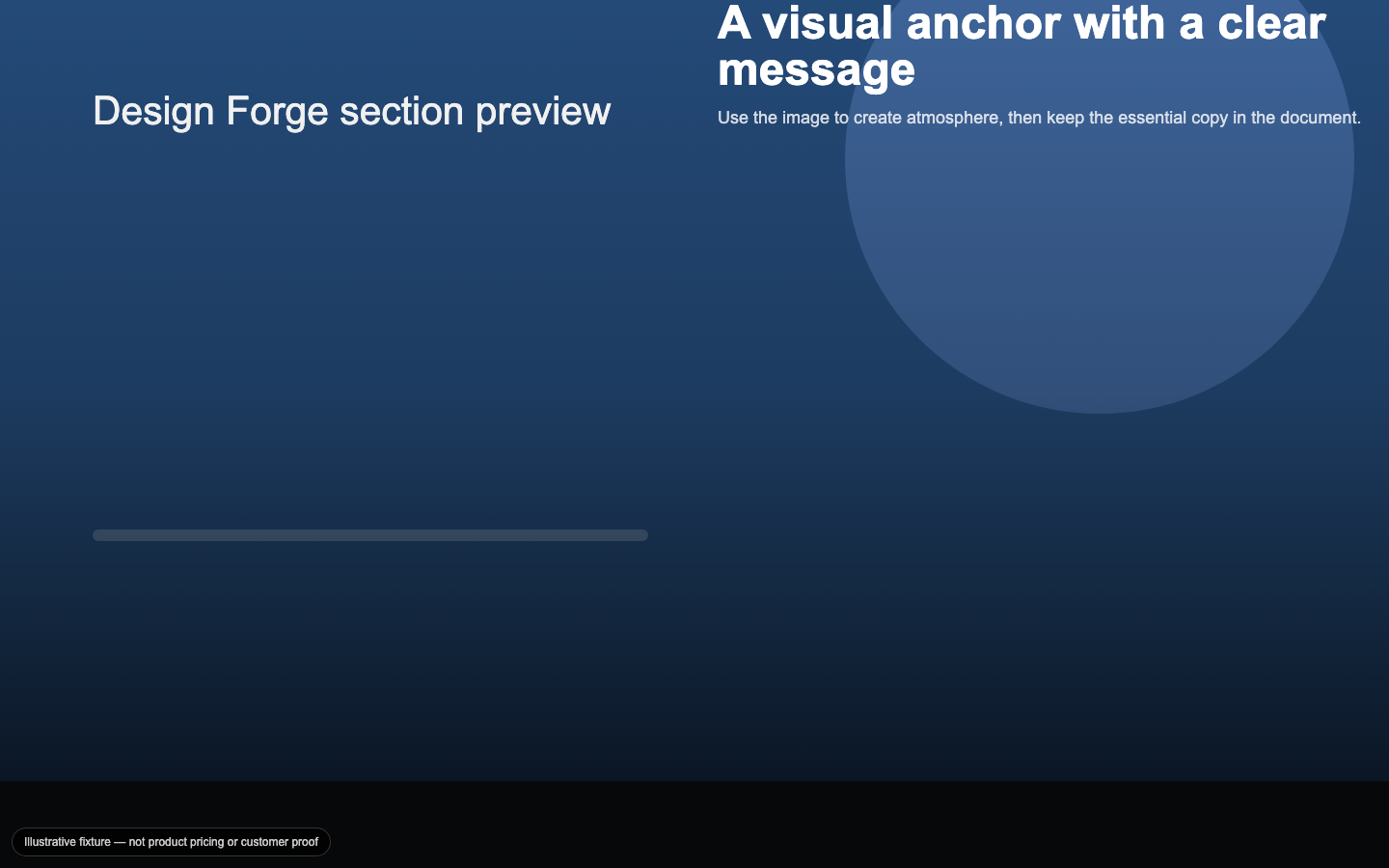
Full-Bleed Media
An edge-to-edge image section with a positioned text overlay and scrim that keeps the message legible over visual media.
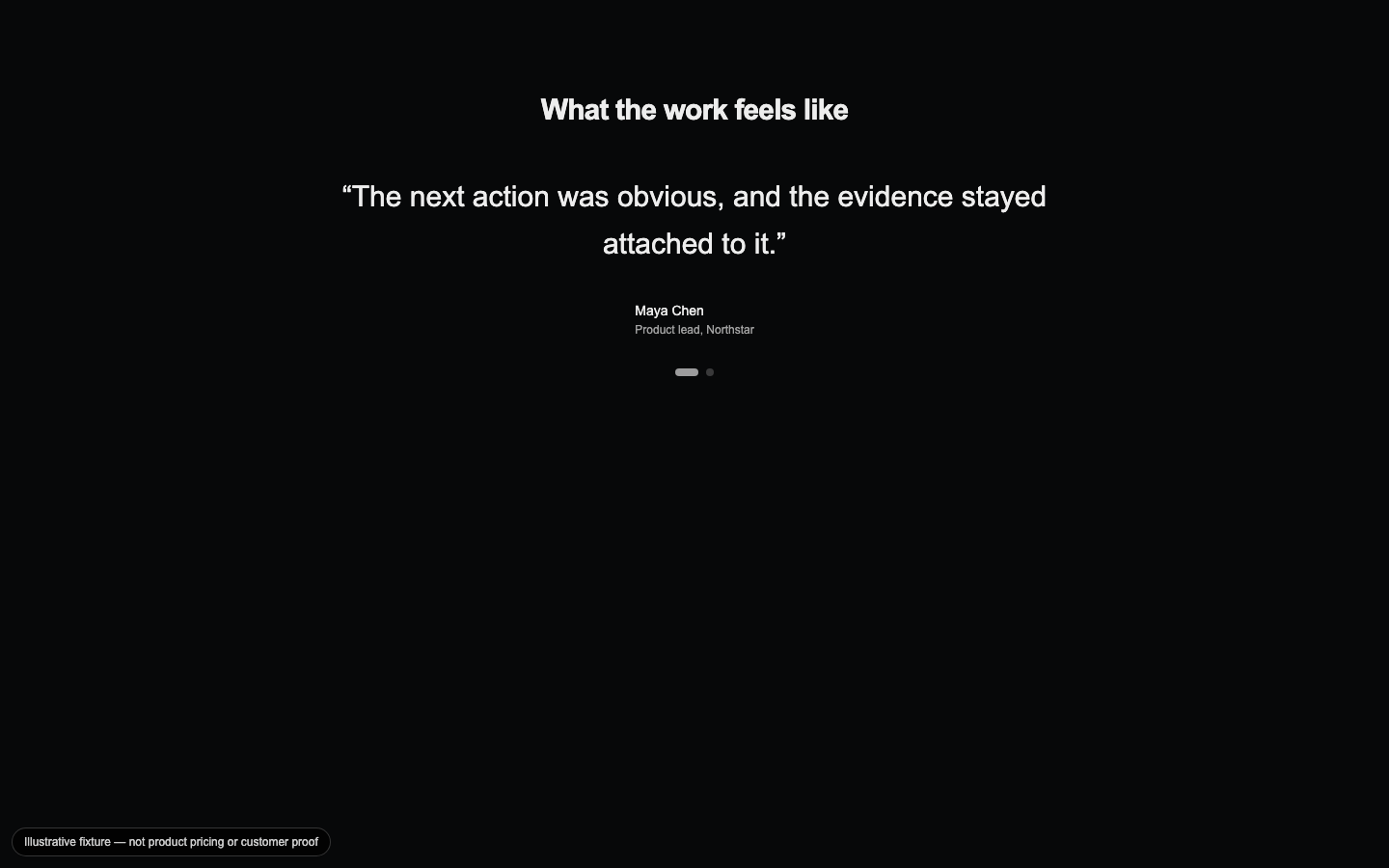
Testimonial Carousel
A keyboard-navigable testimonial rotation that pauses on interaction and turns customer voice into a focused proof moment.
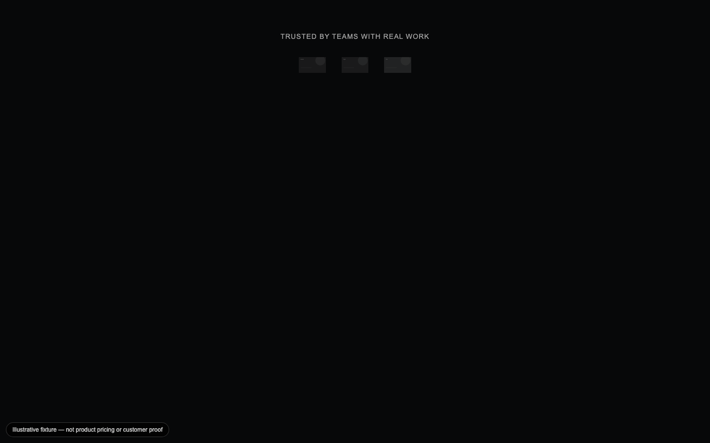
Logo Marquee
A trust strip that moves partner marks as a CSS loop and degrades to a static, accessible logo group under reduced motion.
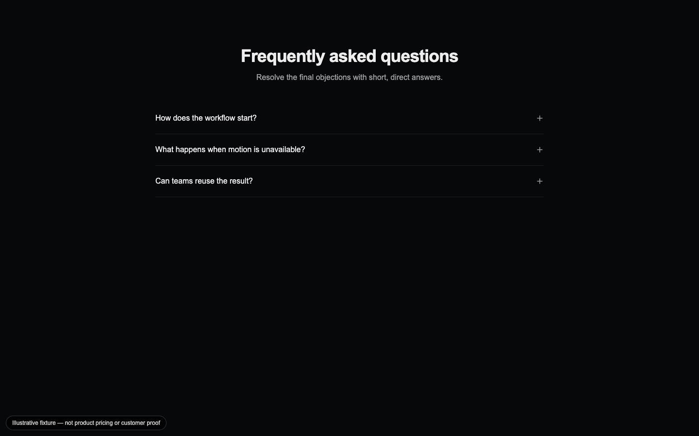
FAQ Accordion
An accessible expandable Q&A section with single- or multi-open behavior for resolving objections near the end of a page.

Gradient CTA
A closing call-to-action with a restrained gradient field, clear hierarchy, and explicit primary and secondary paths.